BAHCO Rebranding
Breathing new life into a 160+ year-old brand

The challenge
As Europe’s leading brand of professional hand tools, BAHCO has spent the last 160+ years setting the industry standards for quality and user-friendly design. But with success comes imitation, and to continue to stand out from the crowd BAHCO partnered with Marketwise to refresh its identity and give it a playful, personable, distinctive spin.
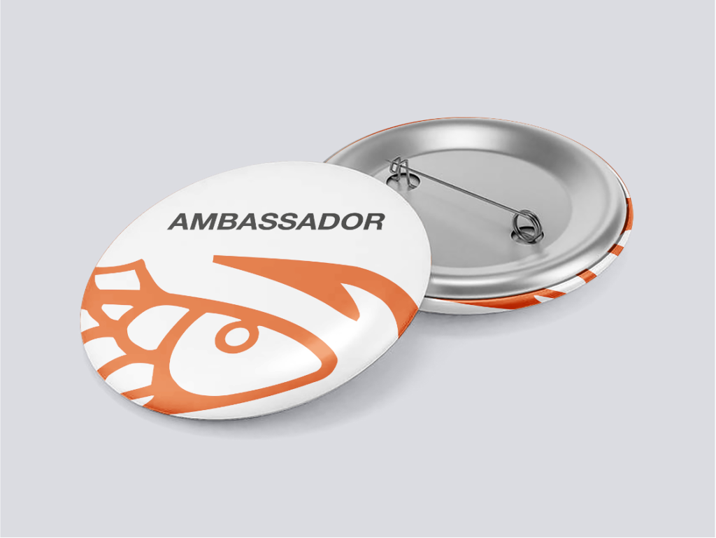
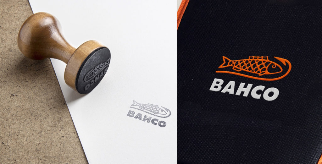
Follow the fish!
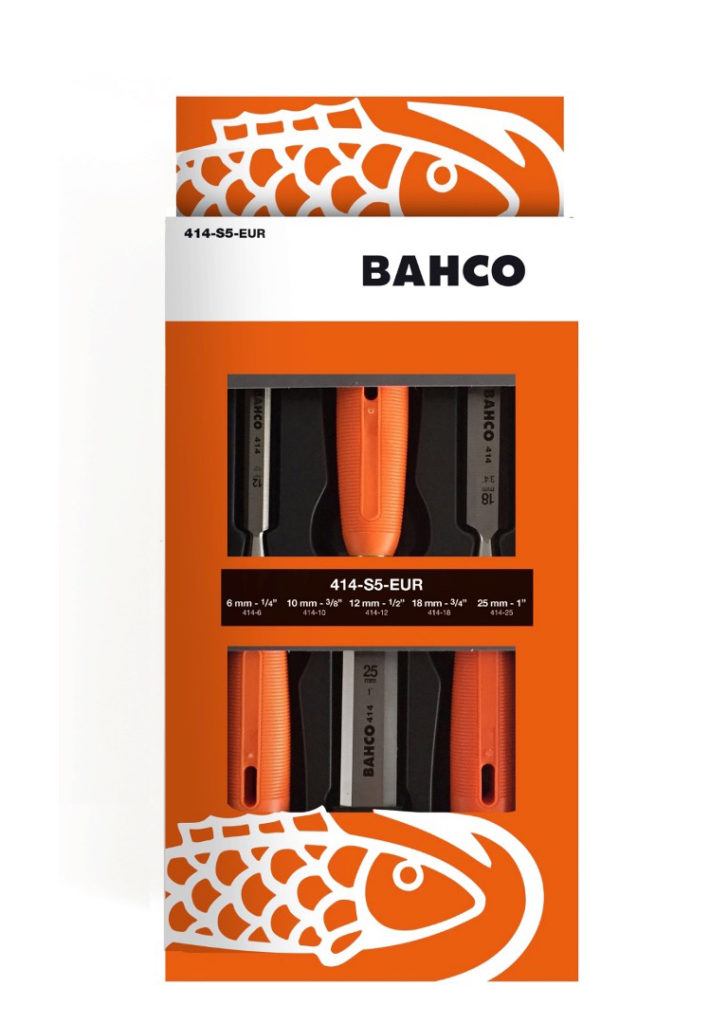
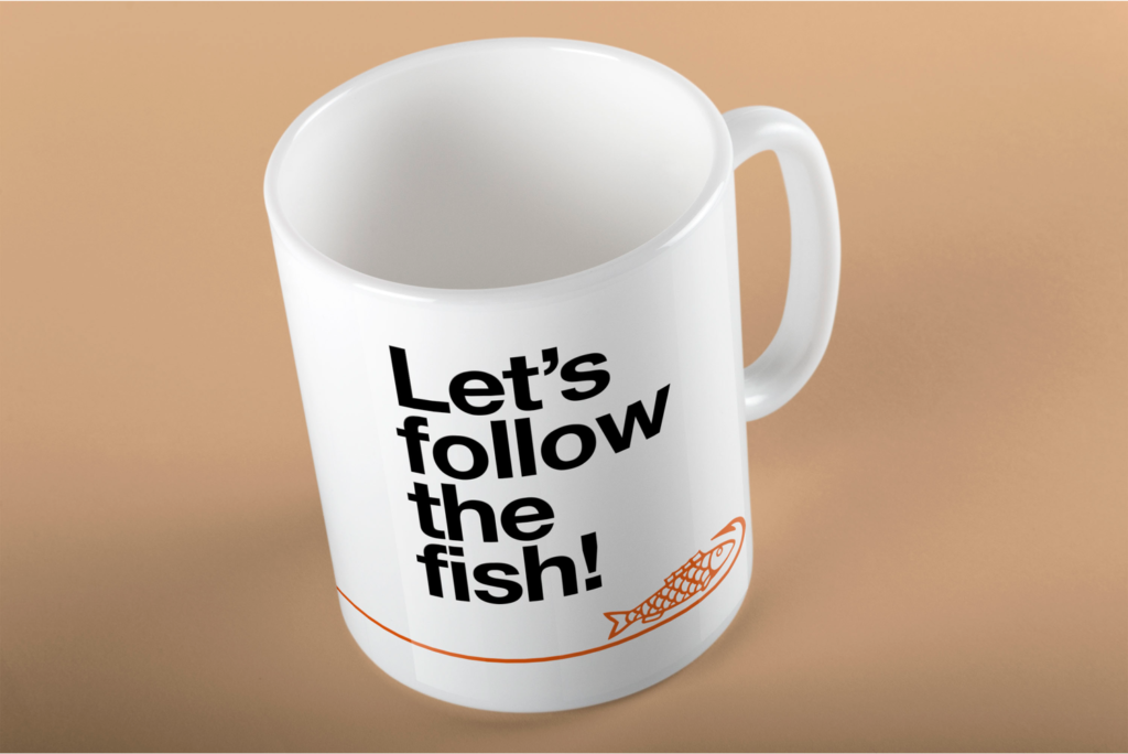
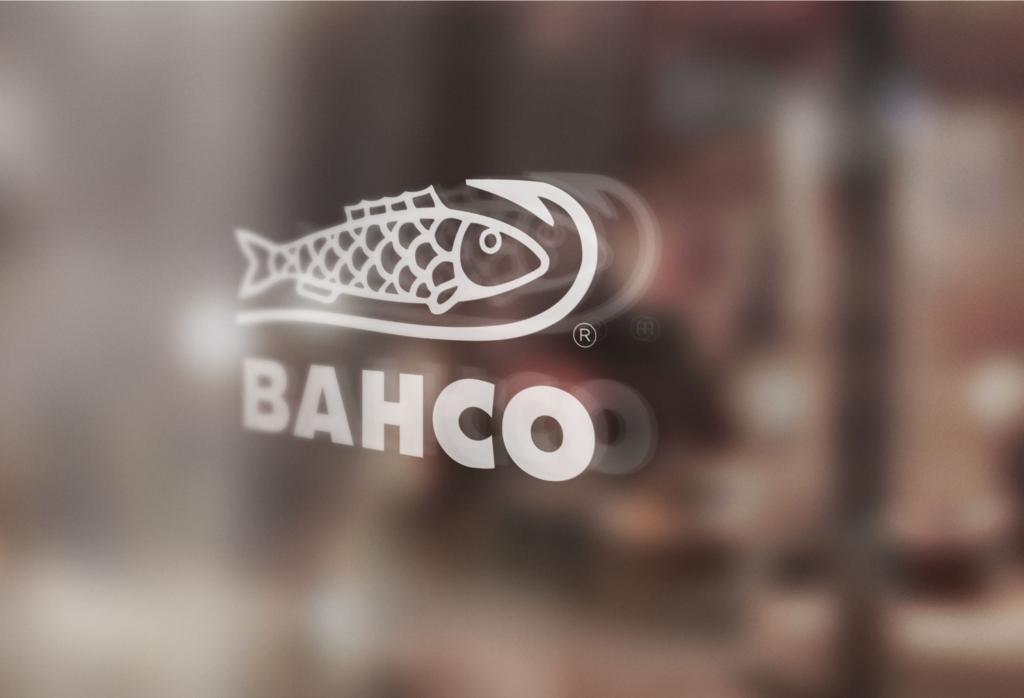
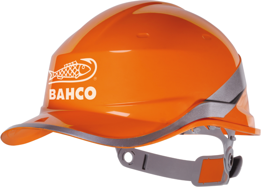
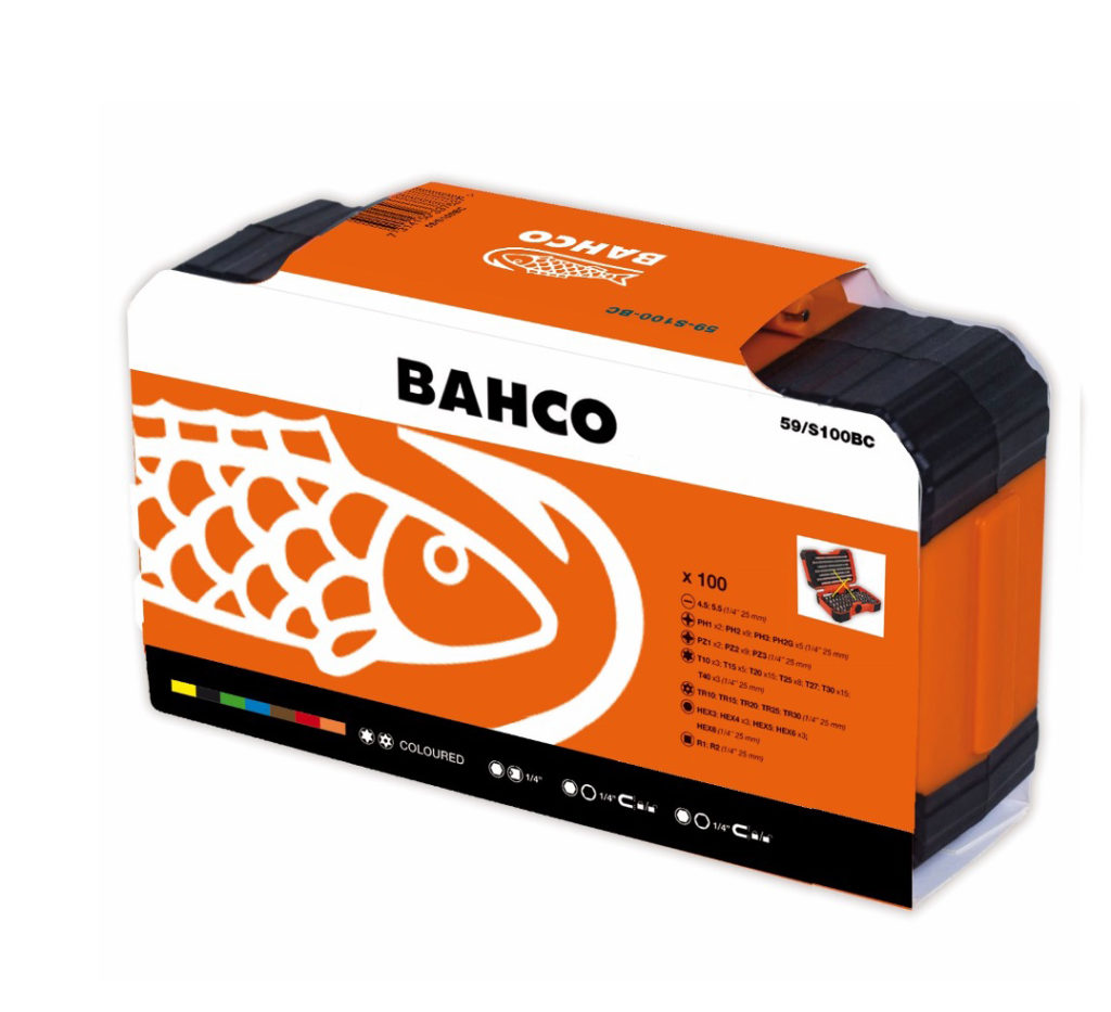
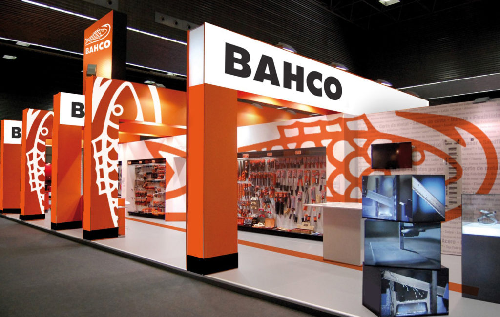
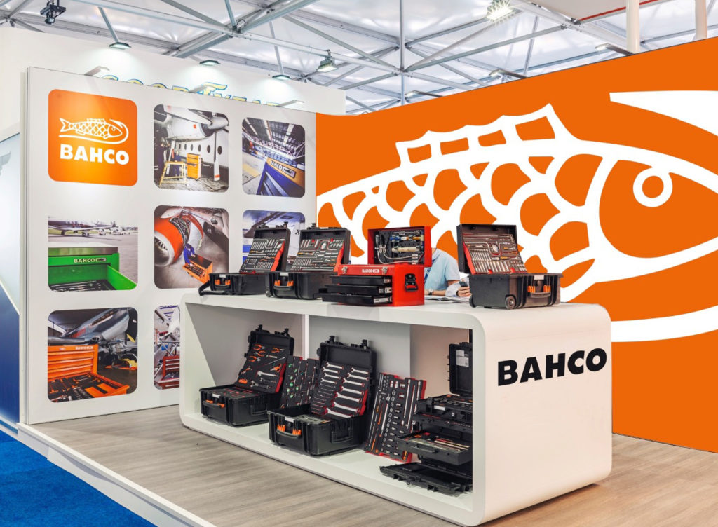
BAHCO’s fish & hook symbol has been iconic to the brand since its 19th century origins. We took it to the spotlight and put it at the heart of the new identity, giving it flair and personality. Paired with bolder lettering, it’s the unmistakable ambassador of BAHCO. Time for a new motto: Follow the fish!

The goal
To increase visibility of the BAHCO brand in an efficient and appealing way.
65%
A customized approach
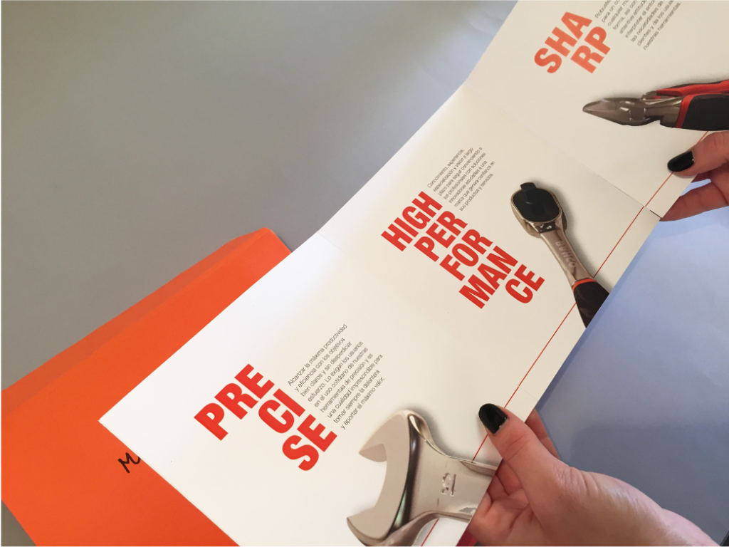
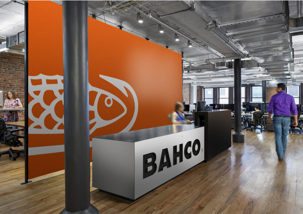
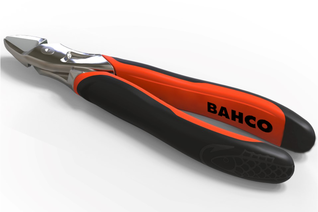
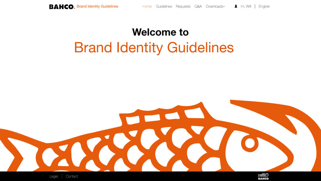
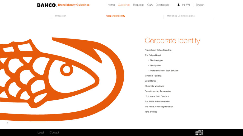
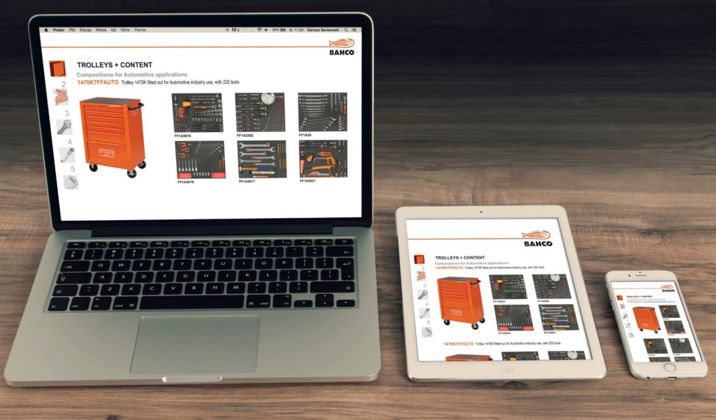
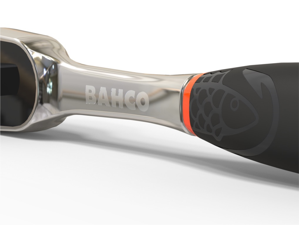
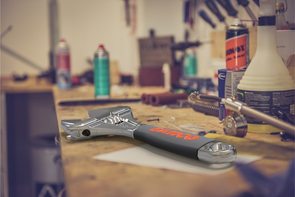
Our process allowed for a progressive transition from the previous identity, avoiding the degradation of existing stocks. We focused on the design of hallmark packaging, working one piece at a time with a creative touch and studying its performance at various eye levels. And then took the same approach to all marketing and point of sale materials, amplifying the new BAHCO brand experience across all physical and digital environments.

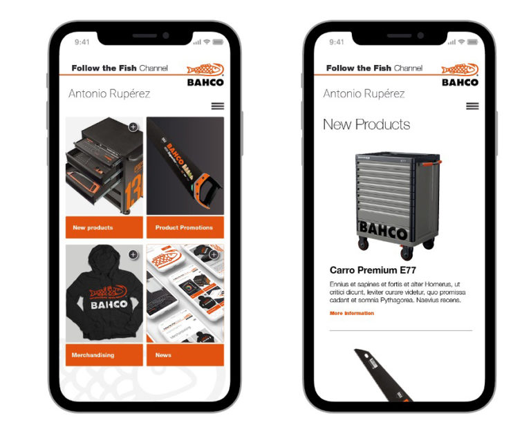
Everyone on board
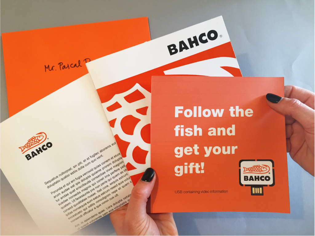
We invited BAHCO’s vast network of clients and distributors to Follow the Fish and embrace it from the very start. The comprehensive brand engagement operation included presentations, a host of explanatory materials (videos, brochures, mailings and more) and an online service to help at every step of the way. And the feedback was overwhelming: they loved it!
3

Stevie Awards 2019 – Gold – Brand Experience of the Year
Galaxy Awards 2019 – Bronze – Brand identity
Stevie Awards 2019 – Silver – Brand Renovation of the Year